Graphy: Revolutionizing Data Visualization
Graphy is a game-changer in the world of data visualization. It offers a radical solution to the challenges of presenting and communicating data effectively.
The core features of Graphy are truly impressive. Its ability to create actionable insights and eliminate ambiguity is a major advantage. Users no longer have to deal with confusing graphs or spend unnecessary time in meetings trying to explain data. With Graphy, fewer meetings are required, decisions can be made faster, and there is less back and forth.
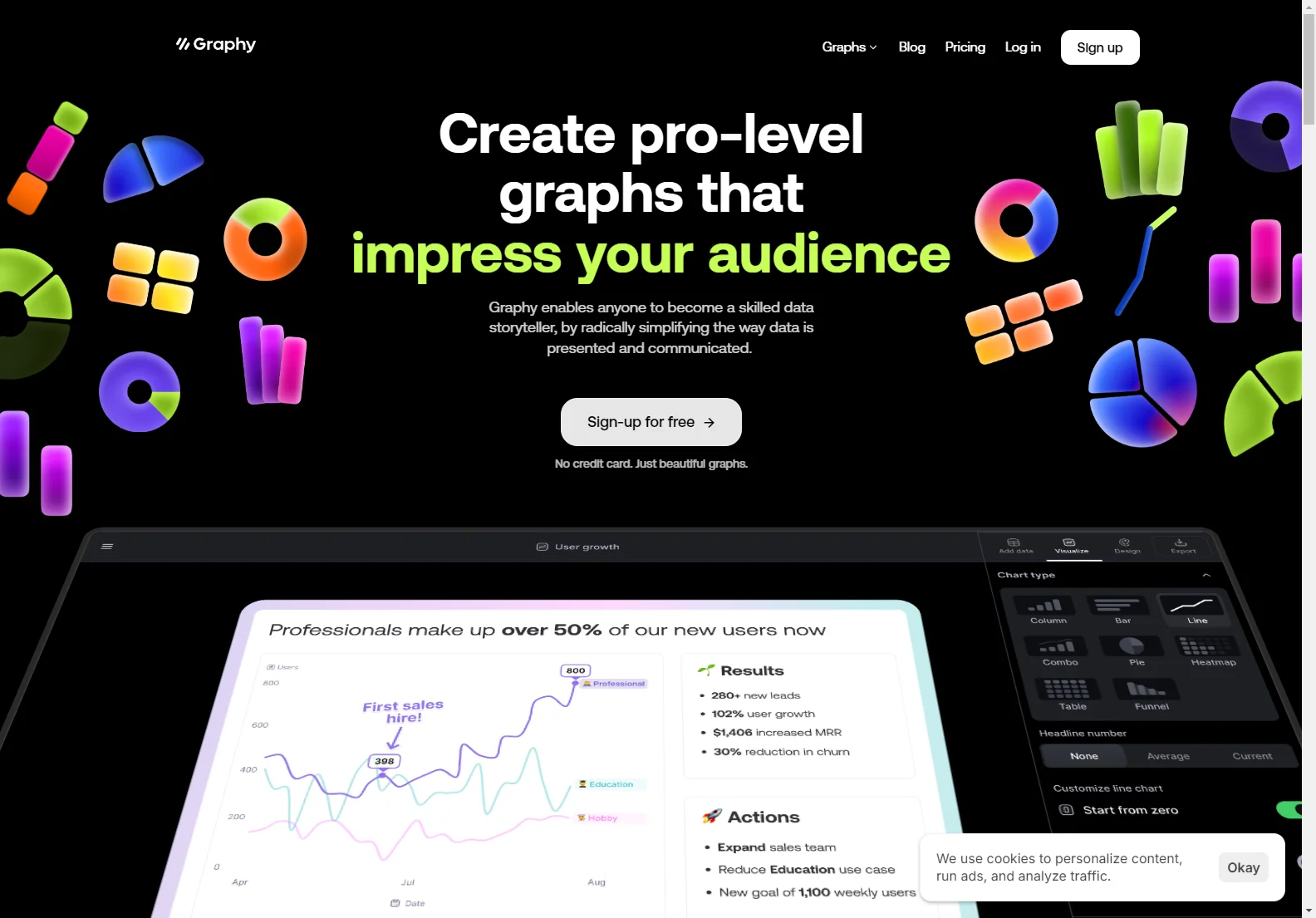
One of the standout features of Graphy is its AI-powered capabilities. Users can add their data, and Graphy's AI will create a chart and explain the key insights. This makes the process of data analysis and presentation much more efficient.
Graphy is also designed with the modern team in mind. It is purpose-built to be simple and delightful to use, with a no learning curve and an intuitive interface packed with powerful features. The results are beautiful, interactive graphs that users will be proud to share.
In addition, Graphy allows for rich storytelling with data. Users can communicate insights and focus attention on key data points with visual annotations and one-click enhancements such as goals and trend lines.
Graphy is not only fast but also highly customizable. It is 80% faster than other data visualization tools, and users can create stunning, super customized charts that make communication of numbers to both investors and team members much clearer.
The tool is also built to be shared easily. Users can collaborate and make decisions together in Graphy, or share graphs as embeds, interactive links, or images in various platforms.
Overall, Graphy is a powerful tool that simplifies the way data is presented and communicated, enabling anyone to become a skilled data storyteller.