The Component Gallery: A Comprehensive Repository of Interface Components
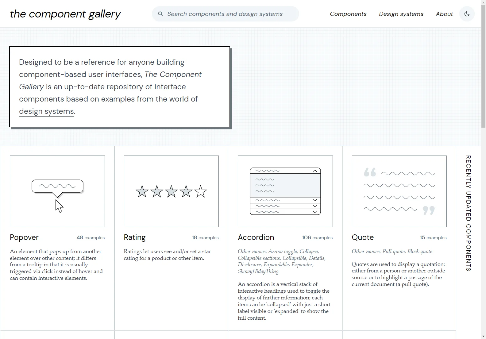
The Component Gallery is an invaluable resource for those involved in creating component-based user interfaces. It serves as an up-to-date collection of interface components, drawing examples from the realm of design systems.
In the gallery, you'll find a diverse range of components. For instance, the Popover component, which appears when an element is clicked and can contain interactive elements. Then there's the Rating component, allowing users to rate products or items with star ratings. The Accordion component is a useful tool for organizing and presenting information. It consists of a vertical stack of interactive headings that can be expanded or collapsed to show or hide the content.
Quotes are also featured, used to display quotations from various sources or to highlight passages within a document. Pagination is another important component, enabling the splitting of information across multiple pages for better navigation. Tabs provide an efficient way to navigate between multiple panels, reducing clutter and maximizing space. And let's not forget the Button component, which triggers actions like submitting a form or showing/hiding other interface components.
In addition to these components, the gallery also showcases Breadcrumbs, a list of links indicating the current page's location in the navigational hierarchy.
The Component Gallery truly is a treasure trove of interface components, offering a wealth of options for designers and developers to create engaging and functional user interfaces.