Vizzy: Simplifying Data Visualization with AI
Vizzy is an exciting AI tool that has been designed to make data visualization a breeze. With its capabilities, it allows users to transform complex data sets into clear and understandable visual representations.
Overview
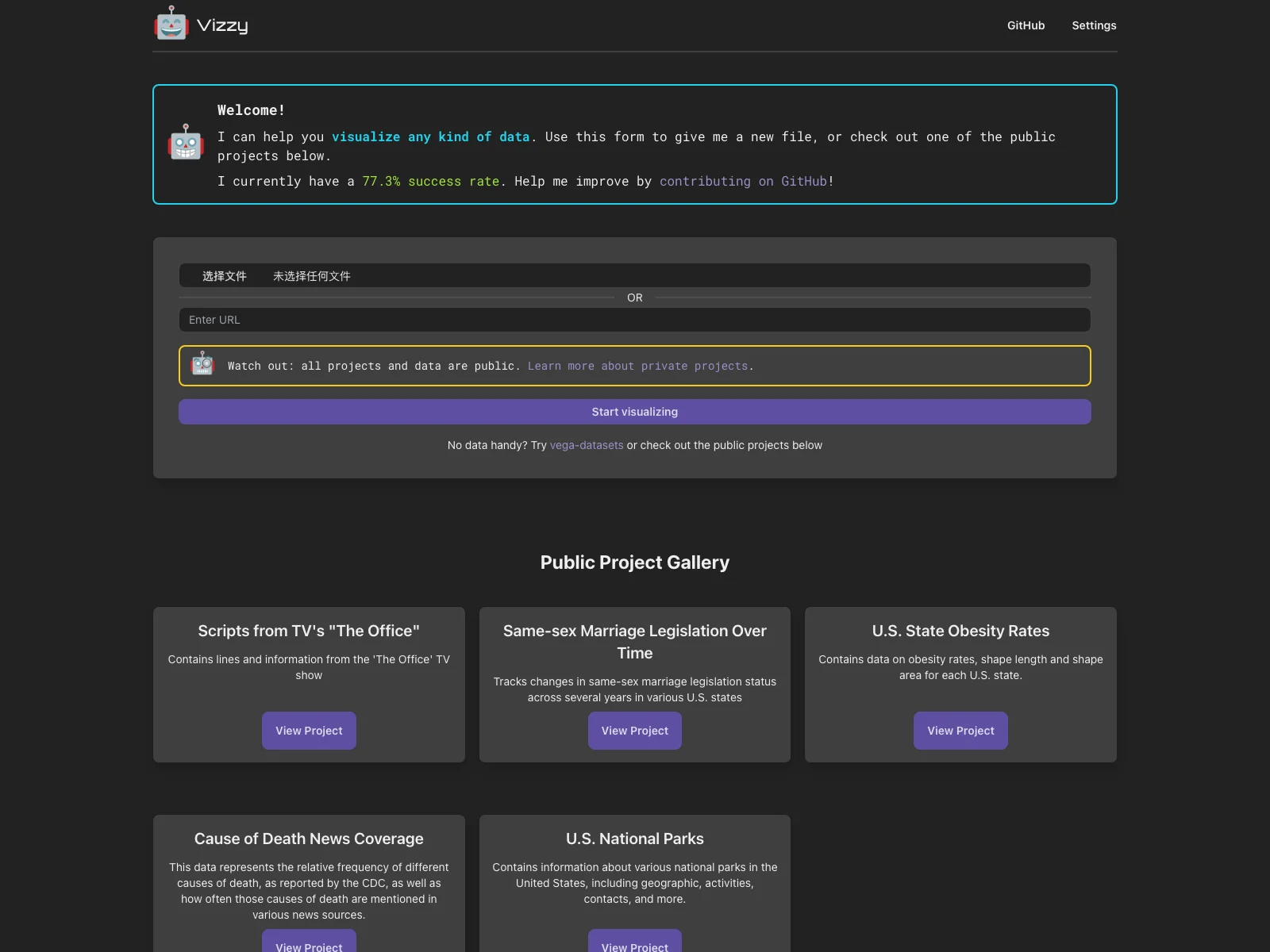
Vizzy offers a user-friendly interface where you can easily input your data. Whether it's from a new file you provide or by exploring one of the public projects available. It currently boasts a 77.3% success rate in accurately visualizing data, which is quite impressive.
Core Features
One of the standout features is its ability to handle different types of data. It doesn't matter if you have numerical data, categorical data, or a combination of both. Vizzy can analyze and present it in a visually appealing way. For example, if you have sales data over a period of time, it can create a line graph that clearly shows the trends and fluctuations.
Another great aspect is its openness to improvement. You can contribute to its development on GitHub, which means it has the potential to get even better over time as more users get involved.
Basic Usage
Getting started with Vizzy is straightforward. If you have data at hand, you can simply use the provided form to upload it. But if you don't have any data ready, there are options like exploring vega-datasets or checking out the public projects already available. And if you encounter any issues or have feedback, you can easily open an issue on GitHub.
Compared to some existing data visualization tools, Vizzy stands out for its AI integration. While other tools might require more manual configuration and analysis, Vizzy can quickly process and visualize data with the help of AI algorithms. This saves users a significant amount of time and effort, making it a great choice for those who need to visualize data on a regular basis.